Silvrback Rolls Out New Look
August 24, 2017Release: August 24, 2017
________________
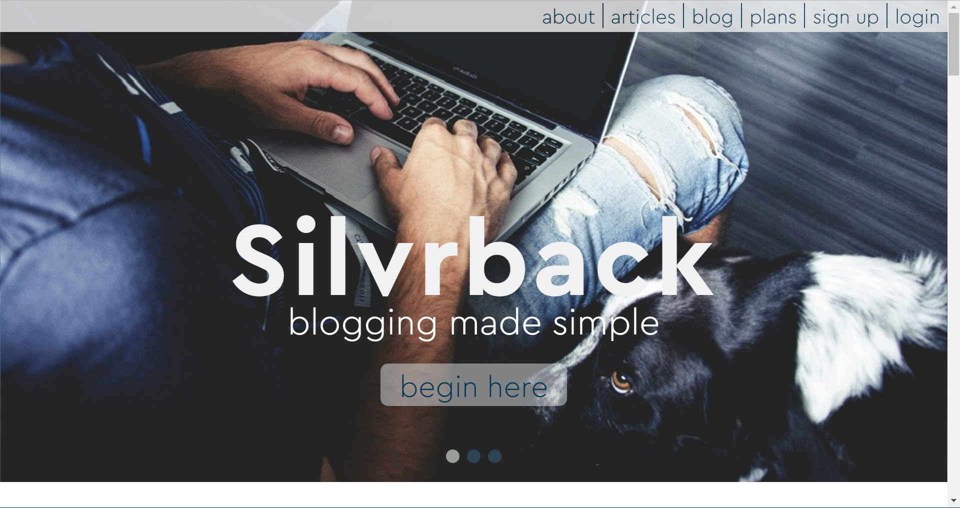
Silvrback1 announced the launch of its new website on Thursday, a release that came less than a year after the previous redesign went live.
"We think the new design better captures the product we offer and the look and feel we're wanting to establish in this crowded space," said Kermit Kuehn, operator of Silvrback.
Kuehn noted that the previous design was the "right idea, but poor in communicating who we are".
The new design is definitely different. The sleek, modern look gives off a somewhat darker and edgier feel. The site is informative but not cluttered, engaging but not overwhelming.

Based on information from the site, this look and tone appears to be targeting a more unconventional, non-conformist writer. Under the section, who should write on Silvrback, Kuehn writes, "If you are a bit on the fringe, don’t quite fit in, perhaps a bit non-conformist, then you should feel right at home with us."
And the "simple" and "minimalist" message appears to be a play to those who don't want all the complexities of a Wordpress or other commercial offerings.
In the introduction to the site in the About Us page, Kuehn writes "Silvrback is an antidote to all the noise, busyness, and the overwhelming number of choices available today. We strive to keep it simple."
Kuehn confirms that he wants Silvrback to be the "anti-Wordpress" option of choice.
"Look, we are not interested in competing with the big commercial houses in the blogging space. We think that most writers want to get down to writing. And they will appreciate the simple, clean approach we provide."
He concludes, "We must continue to develop our product and better communicate our value. The new site is an important piece to get right in that process."
You can visit the site here. And catch up on what has been happening through the Silvrback blog.
1Silvrback is the sole holding of Verde Places LLC, Fort Smith, AR, USA
