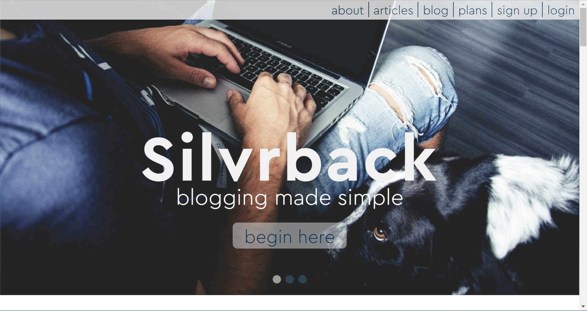
Silvrback Launches New Design
December 12, 2022As you may have guessed, Silvrback released its latest design today. The new look communicates a single message in a stark, even aggressive, first frame. The new design reinforces the darker tone established in the 2017 update.
Aside from giving Silvrback a new look, the design reflects the latest iteration of our sense of who we are as a brand, and where we fit in the crowded blogging space.
The slogan you’ll see in some of our upcoming ads will reflect the idea that blogging is for those who want to communicate on topics more deeply and more thoughtfully than is possible on a typical social media platform.
We refer to this as “writing in complete sentences”. We hope to do a better job of reaching out to these writers and inviting them to call Silvrback home.
Silvrback is for those who want to write. For those who want to write in a clean, distraction-free work space that is simple to navigate.
Simple but not simplistic. Small but not fragile. Supportive but not annoying.
Silvrback. We think it is the best at simple blogging.
Help us get the word out.
Kermit
Oh, and in case you forgot, here's what the first slide of the last one look like.


