Our New Look
December 07, 2016Hey Silvrbackers!
It has been awhile since I've checked in. Shame on me, actually. We have been busy around here, so let me give you a brief update as to what's been happening on Silvrback.
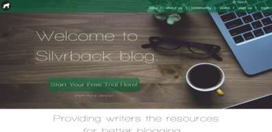
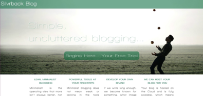
First, if you haven't already noticed, we revamped the look and feel, and re-purposed the Silvrback homepage somewhat. While we're still tweaking this, you'll get the idea where we're going here.
You will notice that the page has become more than a landing page for the app, but a developing space for presenting more information and tips to help writers, current and prospective, achieve their goals of wr iting better, reaching more people, and defining themselves as a brand. We expect to keep building the content as we continue to enhance the capability of Silvrback to support these goals.
We are also using the page to highlight some of you, our users, as examples of the types of blogs visitors will find here on Silvrback.
Of course, the blog app is still central here and why we exist. Th e distinctive app page, focuses on the the current features, options and pricing. The look and feel is to reflect our minimalist commitment, while giving a light and more airy feel.
So, check it out. While we have much more to do to make Silvrback an even better experience, we're pleased with the progress over the past year.
If you think Silvrback has been a good experience for you, do consider recommending us to friends and acquaintances. We would appreciate the good word.
And thanks for sharing your work with us.
